
Standing in front of a mirror holding two “close enough” foundation shades is a familiar moment for a lot of people, and it usually traces back to one confusing question: olive undertone vs neutral undertone. Both categories reject very warm and very cool colors, which makes them easy to mix up even though they behave differently in practice. This guide breaks the two apart clearly, with simple tests you can run at home and a side-by-side chart you can check in seconds. By the end, you will know which one actually describes your skin, and why getting it right changes how your foundation, clothing, and jewelry perform.
Table of Contents
What Does Neutral Undertone Actually Mean?
Direct answer: Neutral undertone means the skin has a relatively balanced mix of warm and cool qualities, without a strong pull toward yellow or pink.
Neutral sits at the midpoint of the classic warm-to-cool scale rather than off to one side. Skin with a neutral undertone often looks comfortable in a wide range of colors, since it does not clash strongly with either golden or blue-based shades. Veins on the wrist frequently look blue-green or genuinely mixed, which is one reason neutral is often the hardest undertone to pin down through a single test.
People with neutral undertone commonly find that both gold and silver jewelry look fine, without either one creating a dramatic improvement. Foundation shopping tends to go smoothly here, since neutral-labeled formulas usually blend in without pulling orange or pink. This balance is exactly what makes neutral skin easy to confuse with olive, since olive skin can also wear a wide range of colors, just for a different underlying reason.
Neutral undertone is not the absence of undertone. It simply means warm and cool qualities are present in roughly equal measure, rather than one dominating the other.
What Does Olive Undertone Actually Mean?
Direct answer: Olive undertone describes skin with a muted green-gray or golden-green cast that exists apart from the standard warm-to-cool scale, rather than sitting exactly in its middle.
Where neutral undertone is a balance point on a single scale, olive undertone is closer to its own category. It shows up as a soft, earthy tint beneath the skin, sometimes described as sage, green-gray, or muted gold, and it can appear at any skin depth from fair to deep. This muted quality, not simple balance, is what defines it.
People with olive undertone often notice that very bright, saturated colors look slightly harsh or overpowering, while muted, complex shades look more natural. Foundation shades frequently swing too pink or too yellow, even at the correct depth, which can look similar to a neutral undertone problem at first glance. The real difference shows up once you compare muted versus clear colors of the same depth, not just warm versus cool ones.
Olive coloring is common among people of Mediterranean, Middle Eastern, South Asian, and Latin American descent, though it appears across many backgrounds. Skin with an olive undertone often tans easily and rarely burns bright red, which is a helpful, though imperfect, supporting clue.
Olive Undertone vs Neutral Undertone: Side-by-Side Comparison
Direct answer: The core difference is that neutral undertone is a balance point between warm and cool, while olive undertone is a muted category that can sit warm, cool, or neutral within itself.
| Comparison Point | Olive Undertone | Neutral Undertone |
|---|---|---|
| Visible cast | Muted green-gray or golden-green | Balanced, no strong yellow or pink pull |
| Best metal | Both gold and silver often work; finish matters most | Both gold and silver typically work evenly |
| Foundation issue | Shades often look too pink or too yellow, even neutral ones | Most standard shades blend in reasonably well |
| Best colors | Muted, complex shades like moss, petrol, or terracotta | A wide range of balanced colors across the spectrum |
| Sun response | Tans easily, rarely burns bright | Varies, not a reliable indicator either way |
| Vein color | Green or teal-leaning | Blue-green or genuinely mixed |
| Defining trait | Mutedness, not balance | Balance, not mutedness |
How the Skin Looks in Natural Light
Neutral undertone tends to look even and unremarkable in daylight, without a strong shift toward yellow, pink, or gray. Olive undertone often looks slightly muted or soft next to very bright colors, almost like a faint gray filter is present, even when the skin itself looks healthy and clear. Standing near a window without makeup is the fastest way to compare the two directly.
Vein Color Differences
Checking the wrist in natural daylight is a useful starting clue, though it should never be the only test. Neutral undertone commonly shows blue-green or genuinely mixed veins that are hard to call one way or the other. Olive undertone often leans more clearly green or teal, though skin depth and lighting can shift the exact shade.
Gold vs Silver Jewelry
This test is less useful for telling olive and neutral apart than for telling either of them apart from warm or cool, since both olive and neutral typically support both metals. A subtle difference is that neutral undertone tends to look equally good with any finish of gold or silver, while olive undertone often responds more specifically to brushed, matte, or muted metal finishes over high-shine pieces. This is a soft distinction, not a hard rule.
Foundation and Concealer Matching
Foundation shopping is where the confusion between these two undertones becomes most frustrating. A neutral-labeled foundation on truly neutral skin tends to disappear into the jawline with little correction needed. On olive skin, that same neutral shade can still look faintly peach, gray, or ashy, which is often the clearest sign that mutedness, not simple balance, is the real issue.
How to Test for Olive Undertone vs Neutral Undertone
Direct answer: Combine the vein test, a muted-versus-clear fabric comparison, and a foundation check in natural daylight, since neutral and olive both fail the basic warm-versus-cool test in similar ways.
The Vein Test
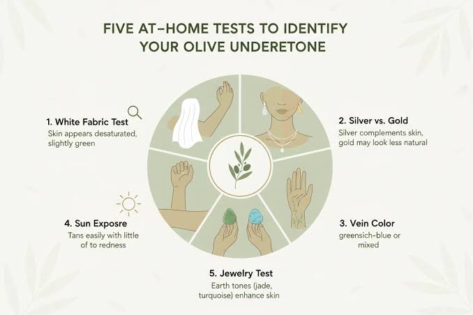
Look at the inside of your wrist in natural, indirect daylight, away from artificial lighting. Blue-green or genuinely mixed veins point toward neutral undertone. Veins with a clearer green or teal cast point toward olive, though this test works best combined with at least one other method.
The Fabric Comparison Test
Instead of testing simple warm versus cool colors, compare a clear, bright color against a muted version of the same hue, such as bright emerald against muted jade. If both the bright and muted versions look equally fine, that leans neutral. If the muted version clearly looks better and the bright version looks slightly harsh, that leans olive.
The Foundation Test
Swatch a neutral-labeled foundation at your correct depth along the jaw and let it settle for a few minutes. If it blends in cleanly with no pink, orange, or gray cast, that supports a neutral undertone. If it still looks faintly off despite matching your depth, an olive undertone is the more likely explanation, especially if a more muted, olive-labeled shade performs better.
Why Olive Undertone Gets Mistaken for Neutral Undertone
Direct answer: Olive undertone gets mislabeled as neutral because both can wear a wide range of colors and both metals without an obvious clash, but olive’s flexibility comes from mutedness rather than true warm-cool balance.
Neutral undertone earns its flexibility because warm and cool qualities are genuinely balanced, so most shades sit somewhere in a workable middle ground. Olive undertone appears flexible for a different reason: bright, saturated colors of any temperature can look slightly harsh, while muted colors of almost any temperature tend to work. From a distance, both patterns look like “this person can wear a lot of colors,” which is exactly where the confusion starts.
The mix-up also happens because foundation brands use “neutral” and “olive” inconsistently, sometimes using them almost interchangeably in shade names. A genuinely neutral-undertone person may pick up an olive-labeled foundation that looks slightly too muted, while a genuinely olive person may end up with a neutral-labeled shade that looks slightly too pink or yellow. Comparing muted versus clear colors, not just warm versus cool ones, is what finally separates the two.
If your results keep pointing toward a cooler direction instead of a true neutral balance, it may help to rule out cool undertone specifically before settling on neutral. This guide olive undertone vs cool undertone walks through that exact comparison, including the vein and jewelry patterns that separate a cool lean from a genuinely balanced or muted one.
Best Colors for Olive Undertone vs Neutral Undertone
Direct answer: Olive undertone favors muted, complex shades like moss, petrol, and terracotta, while neutral undertone comfortably wears a broader range of balanced colors across both the warm and cool sides of the spectrum.
Colors That Flatter an Olive Undertone
Muted, earthy, and slightly smoky colors tend to work best against an olive undertone, including moss green, petrol blue, terracotta, mushroom, and soft aubergine. These shades share a nuanced, complex quality that matches the muted cast already present in olive skin. Very bright, neon, or highly saturated colors tend to look slightly overwhelming or create a subtle gray cast by comparison.
Colors That Flatter a Neutral Undertone
Neutral undertone generally handles a wide range of colors well, from balanced rose and soft teal to taupe, navy, and gentle whites. These shades do not need to be muted or clear specifically, since neutral skin does not push hard against either quality. The main colors to approach carefully are extremely saturated, single-temperature shades that can occasionally look slightly more intense than the face supports.
Makeup and Foundation Tips for Olive and Neutral Skin
Testing foundation along the jawline in daylight remains the most reliable method regardless of which undertone you suspect. For olive undertone, formulas labeled “olive” or “neutral-olive” often outperform strictly “neutral” ones, since standard neutral shades can still carry a faint pink or yellow base. For neutral undertone, most well-formulated “neutral” shades work as advertised, with less need for additional color correcting.
Blush and concealer follow a similar pattern. Olive skin often looks most natural in soft coral or muted rose blush, since overly bright pink or peach can look slightly disconnected from the skin’s muted base. Neutral skin tends to handle a wider range of blush tones comfortably, from soft pink to warm rose, without much risk of looking out of place.
Common Mistakes to Avoid When Identifying Your Undertone
Relying on the vein test alone is the most common mistake, since neutral and olive veins can look frustratingly similar depending on lighting and skin depth. Testing only with plain warm versus cool colors, instead of comparing muted versus clear versions of the same hue, is another frequent error that keeps people stuck between these two labels. Trusting a single foundation shade’s performance, without checking it against a muted alternative, can also lead to the wrong conclusion.
Assuming that flexibility with color automatically means neutral undertone is misleading, since olive skin can appear just as flexible for entirely different reasons. Buying a full new makeup collection or wardrobe based on one online quiz, without confirming the result with a physical fabric or foundation test, often leads to disappointing purchases. Retesting occasionally is reasonable too, since sun exposure, aging, and skincare changes can shift how colors read against the skin even though the underlying undertone stays the same.
Frequently Asked Questions
Is olive undertone the same as neutral undertone? No. Neutral undertone means warm and cool qualities are genuinely balanced, while olive undertone is a muted category that can sit warm, cool, or neutral within itself.
How can I tell if I have an olive undertone or a neutral undertone? Combine the vein test, a muted-versus-clear fabric comparison, and a foundation test in natural daylight. Neutral undertone tends to handle both bright and muted colors equally, while olive undertone clearly favors the muted versions.
Does neutral undertone ever look olive? Neutral undertone can occasionally appear to have a soft greenish quality in certain lighting, but this usually resolves in stable daylight. A genuine olive cast tends to persist across different lighting conditions and photo settings.
Can neutral undertone skin wear the same colors as olive undertone skin? There is overlap, since both undertones handle a wide range of colors reasonably well. The clearest difference shows up with very bright, saturated shades, which usually suit neutral undertone better than olive undertone.
What foundation shade works best for olive undertone vs neutral undertone? Olive undertone often performs better with formulas labeled “olive” or “neutral-olive,” while true neutral undertone usually matches well with standard “neutral” shades at the correct depth.
Why do I keep testing as both olive and neutral undertone? This usually happens when only warm-versus-cool colors are tested instead of muted-versus-clear ones. Repeat the fabric and foundation tests using that distinction, and the result typically becomes clearer.
Final Thoughts
Olive undertone vs neutral undertone is a common point of confusion, and now you have a clear way to work through it. Neutral undertone earns its flexibility from a genuine balance between warm and cool qualities, while olive undertone earns its flexibility from mutedness, favoring complex, softened colors over anything too bright or saturated. Running the vein, fabric, and foundation tests together, and specifically comparing muted versus clear colors rather than just warm versus cool ones, gives a far more reliable answer than any single clue. Once you know which one actually describes your skin, choosing foundation, clothing, and jewelry becomes noticeably more straightforward.